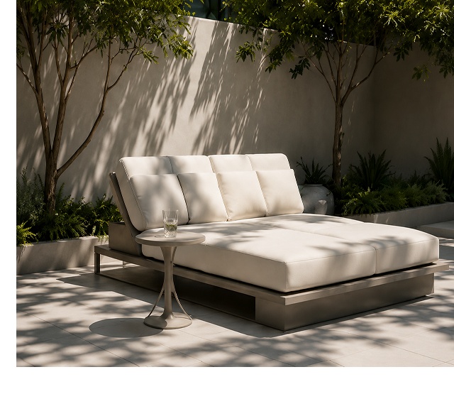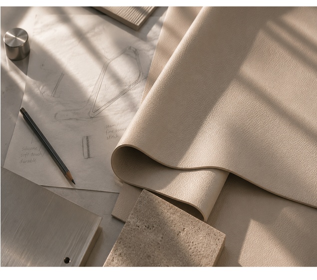
When materials are closely related in tone, small differences in grain, reflectivity and softness become more important. These details create depth without relying on contrast alone.
Start with the environment
The palette should respond to the scale, light and purpose of the room. A healthcare space, hotel lounge and private interior may use similar neutral colors while requiring different levels of warmth, clarity and visual energy.
Context determines which differences need to be emphasized and which should remain quiet.
Use tactile contrast carefully
Smooth and grained surfaces can sit within the same color family while creating a distinct experience. This tactile contrast often feels more durable than a trend-driven color accent.
The relationship is most convincing when materials are viewed at full scale and in the intended construction.
Review color through changing light
Natural and artificial light can shift undertones and alter perceived gloss. Samples should be reviewed at different times of day and beside the finishes that will surround them.
This process helps avoid decisions based on a single controlled viewing condition.
Edit until every material has a role
A successful palette does not need many finishes. Each surface should contribute through function, touch, tone or construction.
Removing redundant choices can make the remaining relationships clearer and support a more coherent environment.